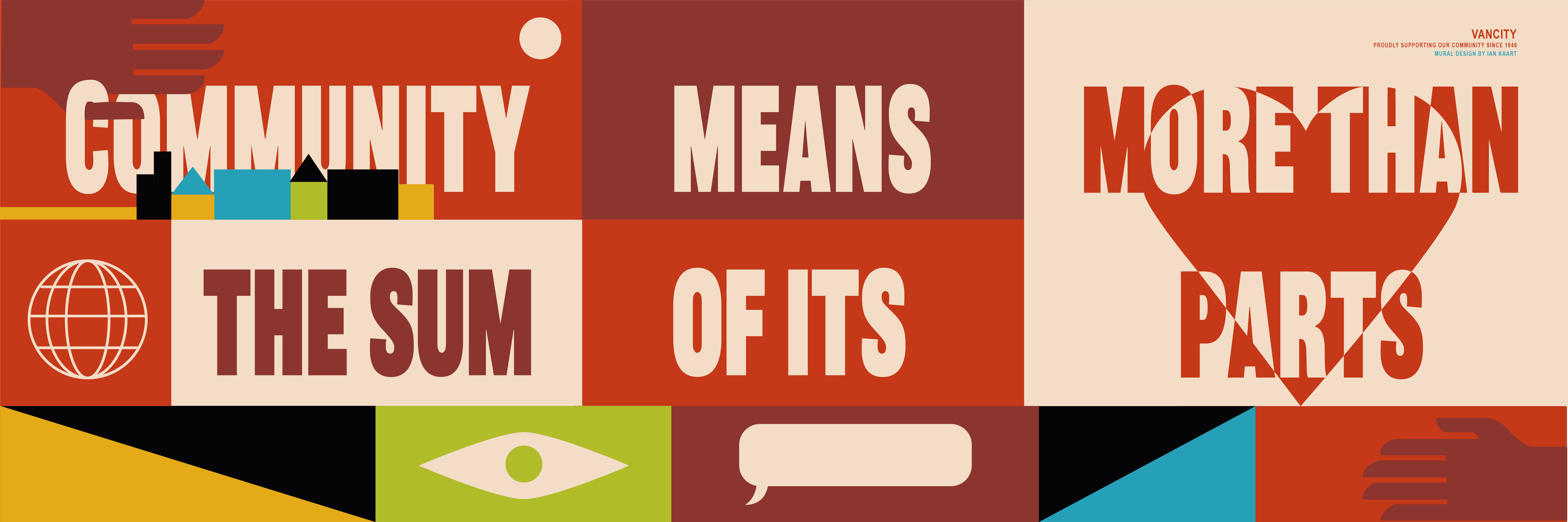
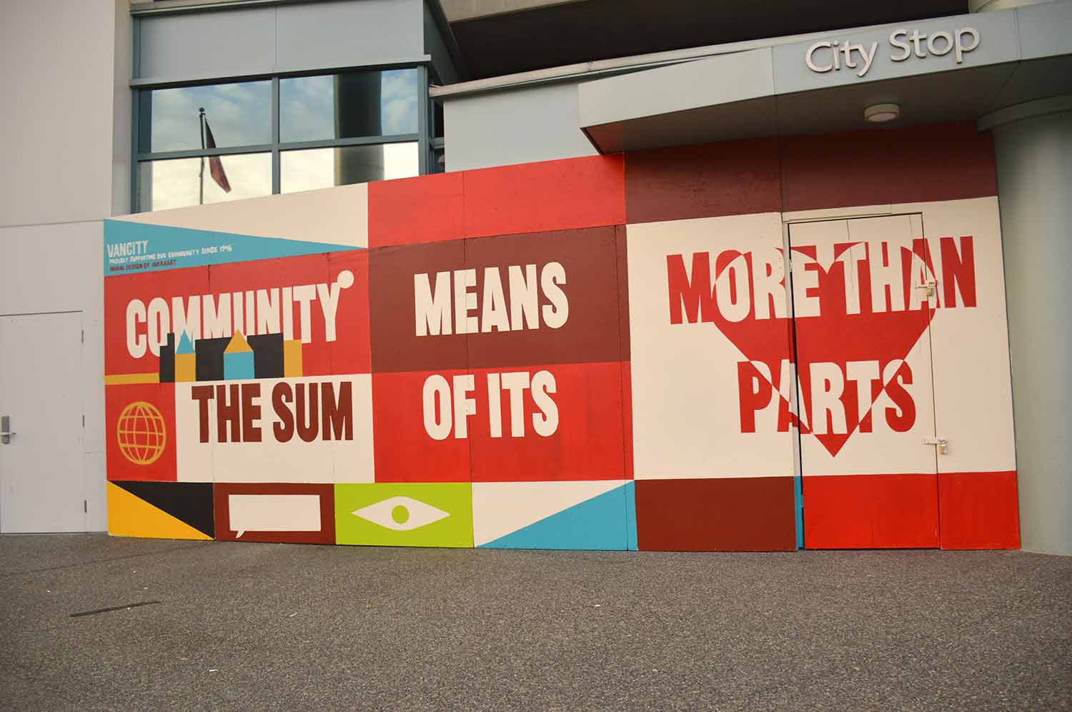
Commissioned directly by Vancity Credit Union to deliver an immediate, emergency-response experiential design solution at their landmark corporate headquarters during the height of the COVID-19 pandemic, this installation frames a physical storefront barrier through the lens of resilient community building. Tasked with transforming a stark, boarded-up perimeter at Terminal Ave and Main Street into an uplifting public touchpoint, I chose to look past passive, purely decorative corporate imagery.
Instead, I audited the physical site parameters and re-engineered the boarded-up façade into a high-visibility canvas for human connection. By using interconnected iconography that mirrors regional community traits and Vancity’s foundational values, the installation successfully transformed an urban barrier into an intentional, shared artifact of local solidarity and collective strength.
PROJECT IMPACT + METRICS
Brand Sentiment & Reach: Generated localized media coverage with a dedicated editorial feature in Vancouver Is Awesome, amplifying Vancity’s community response to an audience of over 400K+ monthly digital readers.
Digital Engagement: Partnered with Vancity’s internal communications team to launch social media campaigns featuring the installation, driving organic impressions, high engagement rates, and positive member sentiment during a critical corporate transition.
Asset Longevity & Value: Delivered a durable, weatherproof large-format solution that maintained 100% visual integrity, protecting and branding the high-traffic perimeter until the branch could safely reopen.
Stakeholder Alignment: Achieved 100% compliance with rigorous municipal public safety guidelines and Vancity’s strict corporate brand identity standards on an accelerated, emergency-response timeline.
Brand Alignment + Spatial Strategy
Rather than treating the physical plywood barriers as an isolated canvas, the project involved rigorous visual research to balance strict corporate identity standards with accessible public storytelling. By isolating and magnifying geometric shapes derived from Vancity’s core brand identity guidelines, the installation translated traditional financial brand elements into an approachable, community-centric language. Collaborating closely with the Director of Marketing at Vancity and key internal stakeholders ensured that every part of the illustration accurately represented Vancity’s multi-decade mandate as a member-owned cooperative financial institution.
Final Asset + Brand Execution
Photographed live following completion, the final view showcases the installation functioning as an active piece of community-first public infrastructure. The focal centerpiece features the custom typographic statement, “Community means more than the sum of its parts,” anchoring the layout. By seamlessly weaving human-centric symbolism into Vancity’s official corporate color palette, the final environmental asset successfully humanized a stark urban barrier, generating highly positive brand sentiment both on the physical street corner and across digital public media channels.